How to choose the right size for a fine-art landscape print
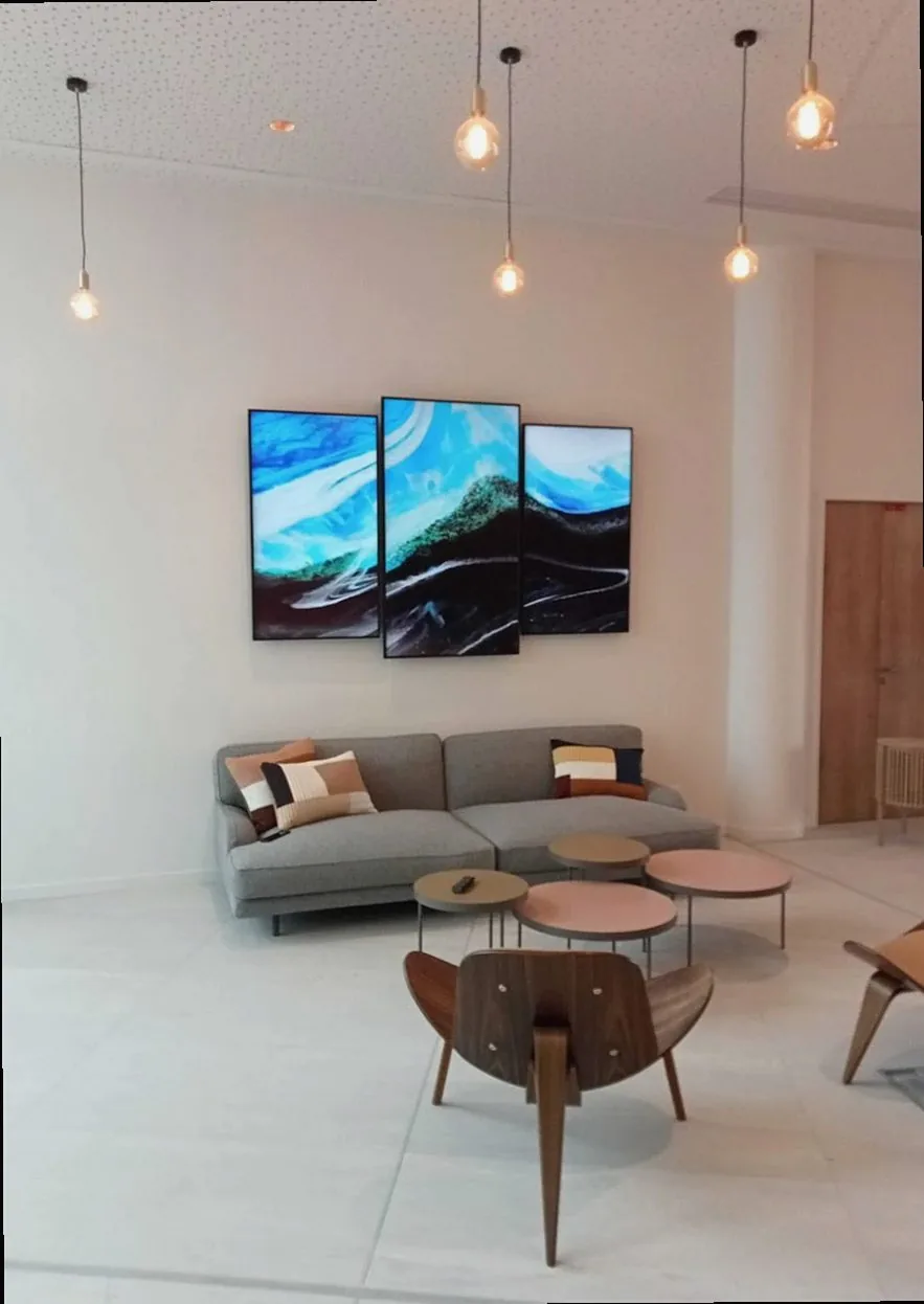
A print arrives rolled in archival tissue, and for a moment it fills the dining table completely — vast, luminous, almost too much. Then it goes up on the wall and somehow shrinks, dwarfed by the ceiling height and the space on either side. It is one of the most common disappointments in fine-art printing, and almost always avoidable. Choosing the right size for a landscape print is not purely a matter of taste; it is a conversation between the image, the room, and the conditions under which a person will actually stand and look. Getting that conversation right means understanding a handful of concrete principles around viewing distance, paper weight, and the tonal character of the photograph itself.
Reading the wall before anything else
The single most reliable starting point is the viewing distance — the span of floor between where a person will naturally stand and the surface of the print. In a Japanese living room with standard 240 cm ceilings, that distance is typically somewhere between 2.5 and 4 metres depending on furniture placement. A useful rule of thumb drawn from fine-art display practice is that a print's longest edge should be roughly one third to one half of that viewing distance to hold presence without overwhelming. So a sofa set 3 metres from a wall calls for a print whose longest dimension sits somewhere between 100 and 150 cm — dimensions that feel generous in a catalogue but often read as exactly right once framed and hung.
Wall width matters equally. A print that leaves less than 30 cm of bare wall on each side tends to feel cramped, while one that covers less than half the wall's width can appear to float nervously rather than anchor the room. A practical approach is to cut sheets of lining paper or kraft paper to your intended dimensions and tape them to the wall for a day or two. Living with the shape in natural and artificial light, at breakfast and in the low amber of a Japanese winter afternoon, tells far more than any measurement taken in isolation.
Architectural features change the calculation significantly. A chimney breast in a traditional Japanese timber house creates a defined panel — often 90 to 120 cm wide — that accepts a vertical or square composition much more comfortably than a horizontal panorama. Conversely, the long unbroken walls common in open-plan apartments built after 2000 are exactly where a wide-format print, perhaps 180 cm across, can finally breathe. Neither context is inherently better; they simply ask different things of the image.
How paper weight and surface finish shape the decision
Print size and paper specification are more tightly linked than most buyers expect. A large print on a paper lighter than 200 gsm will flex noticeably when mounted behind glass, creating subtle waves that catch raking light — particularly problematic in rooms where windows sit to one side of the wall. Fine-art giclée papers in the 300–350 gsm range, such as Hahnemühle Photo Rag or Canson Infinity Baryta Photographique, have enough body to lie flat at sizes up to around 100 × 70 cm without a backing board. Above that, a rigid aluminium Dibond mount or a deep hardwood frame with a backing panel becomes worth the additional cost.
Surface finish interacts with room lighting in ways that shift depending on scale. A baryta paper — semi-gloss, with a slight sheen reminiscent of traditional darkroom fibre-based prints — renders shadow detail with exceptional depth and makes a dramatic statement at large sizes in rooms lit by warm, directional sources such as track lighting or angled picture lights. A matte cotton rag surface diffuses light rather than reflecting it, which works beautifully in spaces with strong northern daylight, the kind of cool, even illumination that characterises many Japanese homes from autumn through to early spring. At smaller sizes, below roughly 50 × 40 cm, these distinctions become less decisive — but at 120 cm and above, choosing the wrong finish for the room's light can flatten a landscape that was supposed to feel expansive.
One practical step that is easy to overlook: request a sample print before committing to a large format. Most quality fine-art print studios will produce a small test on your chosen paper, and placing that sample in the intended room, at the right hour of day, answers questions that no screen can settle.
The paper is part of the image — not its carrier, but its final layer.
Tonal range and what it demands from scale
Landscape photographs vary enormously in their tonal complexity, and that complexity has a direct bearing on the minimum size at which an image resolves properly. A high-contrast scene — say, a fjord at midsummer with sharp reflections and deep cliff shadows — holds its impact at relatively modest dimensions because the eye reads it quickly through strong structural contrast. The information is coarse-grained enough to read at 60 × 40 cm. A softer, more tonally compressed image — fog lifting off a mountain plateau in September, or the pale silver of a coastal sky in February — carries its meaning in subtle gradations that only become legible at larger sizes. Print that kind of image too small and it simply looks grey and undifferentiated. The detail that makes it atmospheric, the slow transition from one tone to the next, needs room to develop across the paper.
- High contrast, graphic scenes: readable from 60 cm on the longest edge
- Soft tonal gradients and fog: generally need at least 90–100 cm to resolve
- Wide panoramic ratios (3:1 or wider): minimum 120 cm to avoid feeling narrow
- Very fine foreground detail, such as water texture or lichen on rock: benefits from 90 cm minimum even in high-contrast images
- Monochrome or near-monochrome palettes: err toward larger sizes — colour gives the eye orientation that black-and-white does not
Every wall, every room, and every image asks slightly different questions, and working through those questions carefully before ordering is always time well spent. If there is any uncertainty about dimensions, paper, or how a specific image will translate at scale, Magic Fjord is glad to talk it through.